King's Hawaiian unveils fresh packaging design for 75th anniversary
Business
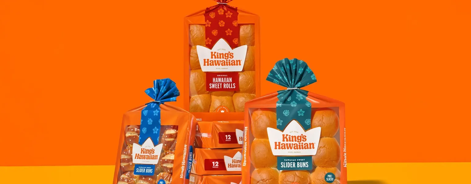
King's Hawaiian, known for its popular sweet rolls and other baked goods in America, has introduced a refreshed brand identity as part of its 75th anniversary celebrations. The updated look is being rolled out across the company’s digital platforms and social media channels, with newly designed packaging set to appear in stores beginning in early July.
The revised branding maintains familiar elements such as the signature orange border and the see-through packaging window that showcases the rolls inside. These are now complemented by a new colour scheme featuring red, yellow, gold and cream tones—colours said to reflect both the brand’s heritage and the warmth of its community.
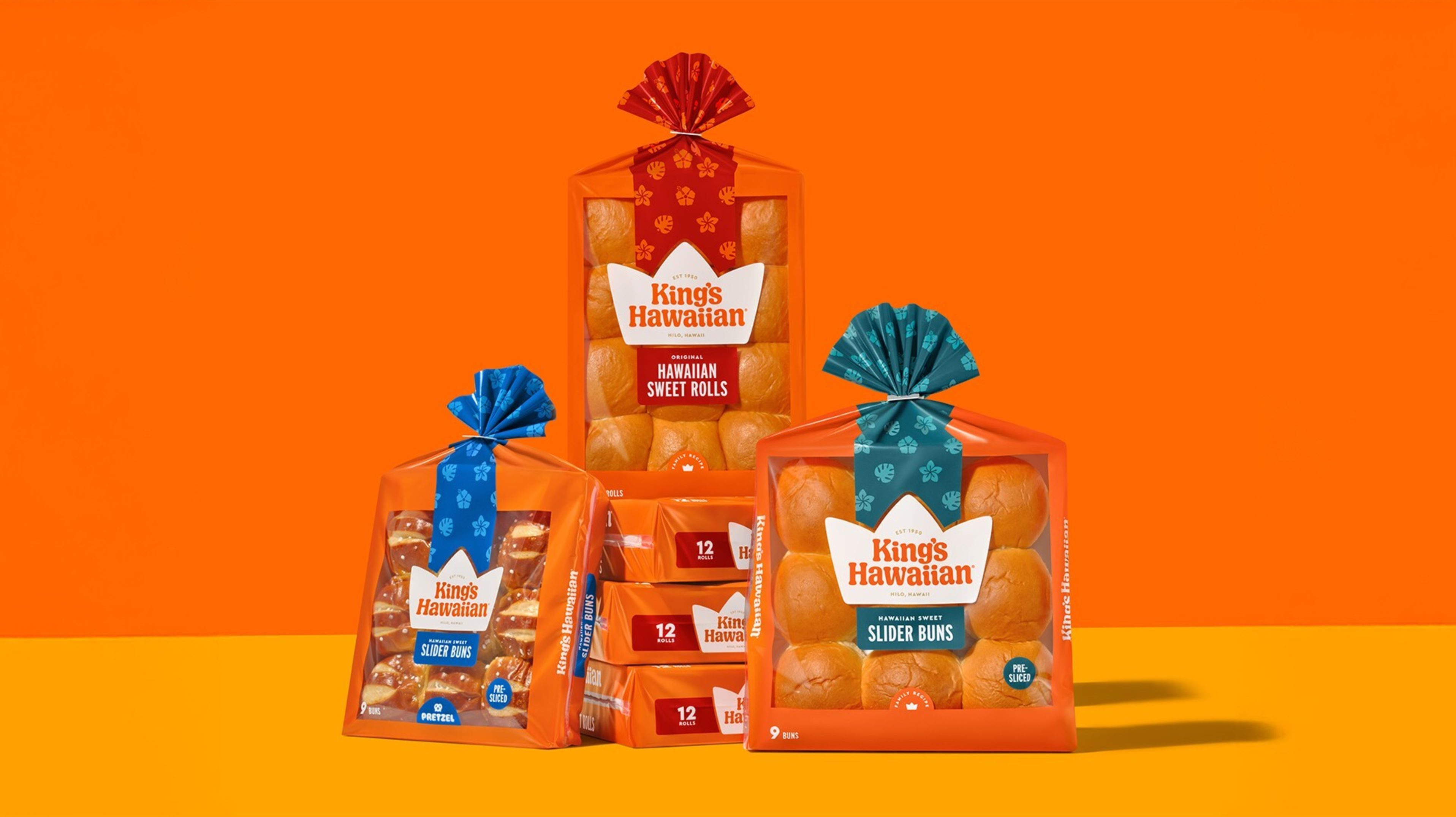
A floral ribbon design, inspired by native Hawaiian motifs, has been added across all packaging to give a gift-like appearance and pay tribute to the company’s roots. The updated visual identity also includes a new typography system intended to convey a more inviting and playful tone.
Raouf Moussa, Chief Marketing Officer at King's Hawaiian, said: As we mark the milestone of King's Hawaiian's 75th anniversary, we want to not just look back at the company's past, but think about the next 75 years as well. This felt like the perfect time to evolve our visual identity so that our brand look and feel reflects the warmth, good times and Aloha Spirit that has come to define King's Hawaiian with modern flourishes that will stand the test of time.
The changes aim to honour the company's history while engaging a new generation of consumers.
Related News
-
Supplier News
AmbaFlex: Boosting bakery efficiency with smart accumulation solutions
-
Sustainability
Australian bread manufacturer launches 30% recycled plastic bread bags
-
Supplier News
Hugo Beck celebrates 70 years of packaging innovation with Open House events
-
Events
London Packaging Week 2025 opens registrations for landmark 15th anniversary edition
-
Business
Behind closed doors: PHARMAP’s 5th anniversary
Latest Packaging News

UK delay to flexible plastics collections could put carbon savings at risk
The UK Government has confirmed that councils in England will not be required to collect flexible...
Refillable packaging offers solution to cosmetics waste challenge
As sustainability moves from being a niche differentiator to a baseline expectation in the...
Introducing Rotondo: Spectra's sophisticated new silhouette
With its subtly balanced profile and smooth curved base, Spectra’s new Rotondo offers a premium...
Syntegon publishes 2025 Sustainability Report and advances sustainability development
Syntegon, a strategic lifecycle partner to the pharmaceutical, biotech, and food industries, today...